Introduction: A Smarter Way to Design for a Complex Digital World
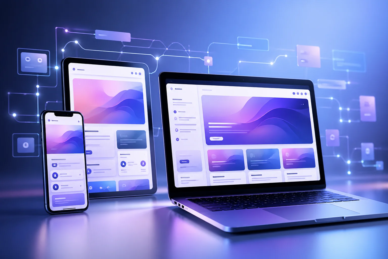
Modern digital design is no longer limited to one screen or one device. Today, users interact with websites and applications across phones, tablets, laptops, TVs, and even wearable devices. In this environment, traditional pixel-perfect design is starting to fail.
This is where pxless comes in.
Pxless is not a tool, framework, or software. It is a design philosophy that shifts focus from rigid pixel values to flexible, adaptive systems. Instead of controlling every detail with fixed measurements, pxless emphasizes behavior, relationships, and scalability.
This guide provides a complete, practical, and advanced understanding of pxless—from basic concepts to real-world implementation.
What Is Pxless? (Core Definition)
Pxless refers to a design approach that reduces reliance on fixed pixel (px) values and instead uses flexible, relative units and fluid layouts.
In simple terms:
- Traditional design: fixed sizes like 200px, 16px
- Pxless design: flexible values like %, rem, em, vw
The focus shifts from:
- “How many pixels?” → to → “How should this behave?”
Pxless does not eliminate pixels completely. Instead, it changes how designers think—favoring proportions, adaptability, and user experience over exact numbers.
Why Pxless Matters in Modern Design
1. Explosion of Devices
Modern users access content on countless screen sizes. Fixed layouts often break in such environments.
2. Better User Experience
Flexible systems ensure:
- Readable text
- Balanced layouts
- Consistent usability
3. Accessibility Improvements
Pxless supports:
- Zooming
- Larger font settings
- Assistive technologies
This makes interfaces more inclusive and user-friendly.
4. Easier Maintenance
Adaptive systems reduce:
- Bugs
- Redesign effort
- Device-specific fixes
Core Principles of Pxless Design
1. Fluid Layouts
Use layouts that expand and shrink naturally instead of fixed widths.
2. Relative Units Over Pixels
Use:
- rem → scalable typography
- % → flexible containers
- vw/vh → viewport-based sizing
3. Content-First Design
Design around content, not fixed layouts.
4. System-Based Thinking
Build design systems, not individual pages.
5. Behavior Over Precision
Focus on how elements behave across environments rather than exact dimensions.
Beginner to Advanced Understanding
Beginner Level: Breaking the Pixel Habit
At this stage, you learn:
- Fixed layouts are fragile
- Users see different screens
- Flexibility improves usability
Intermediate Level: Responsive Systems
You start using:
- CSS Grid and Flexbox
- rem/em units
- percentage layouts
Result:
- Smooth scaling
- Fewer breakpoints
- Better adaptability
Advanced Level: System-Driven Design
You build:
- Design tokens (spacing, typography)
- Component-based UI systems
- Adaptive spacing rules
At this level, you design systems, not screens.
How Pxless Works (Technical Foundation)
1. Relative Units
Replace pixels with flexible values:
- rem
- em
- %
- vw / vh
2. Fluid Typography
Text scales dynamically using modern CSS functions.
3. Flexible Layout Systems
Use:
- Flexbox
- CSS Grid
4. Intrinsic Design
Elements adapt based on content and container size.
Expert Tips, Strategies, and Best Practices
1. Create a Design Scale
Use consistent spacing systems like:
- 4pt or 8pt scale
2. Use Pixels Only When Necessary
Use px for:
- Borders
- Icons
- Fine details
3. Build Design Tokens
Define reusable rules for:
- Typography
- Spacing
- Colors
4. Test Extreme Conditions
Check:
- Small screens
- Large screens
- Zoomed layouts
5. Think in Relationships
Focus on:
- Hierarchy
- Proportion
- Rhythm
Real-World Examples and Case Studies
Case Study 1: SaaS Dashboard
Problem:
- Layout breaking on tablets
- Text overflow issues
Solution:
- Removed fixed widths
- Implemented flexible grid
- Used rem-based typography
Result:
- Reduced UI bugs
- Improved readability
- Faster development
Case Study 2: Content Website
Problem:
- Poor mobile readability
Solution:
- Fluid typography
- Flexible containers
Result:
- Increased engagement
- Better user experience
Common Challenges and Solutions
Challenge 1: Loss of Control
Solution: Use structured design systems.
Challenge 2: Inconsistent Layouts
Solution: Define clear spacing and typography rules.
Challenge 3: Learning Curve
Solution: Start with one component and scale gradually.
Challenge 4: Poor Implementation
Solution: Document design logic and test continuously.
Pxless vs Traditional Pixel Design
| Feature | Pixel-Based Design | Pxless Design |
| Layout | Fixed | Fluid |
| Units | px | rem, %, vw |
| Flexibility | Low | High |
| Maintenance | High | Low |
| Responsiveness | Breakpoints | Continuous scaling |
Future Trends and Predictions
Pxless is aligned with the future of digital design.
1. AI-Driven Interfaces
Layouts that adapt automatically based on user behavior.
2. Multi-Device Ecosystems
Designs that work across:
- AR/VR
- Wearables
- Smart environments
3. Accessibility-First Design
Flexible systems naturally support accessibility needs.
4. Fully Adaptive Design Systems
Design systems will become more intelligent and self-adjusting.
Actionable Takeaways and Implementation Steps
Step 1: Replace Pixels Gradually
Start using rem, %, vw instead of px.
Step 2: Build a Scale System
Define spacing and typography ratios.
Step 3: Use Flexible Layouts
Adopt Flexbox and Grid.
Step 4: Create Reusable Components
Design adaptable UI elements.
Step 5: Test Across Devices
Continuously test responsiveness.
Step 6: Document Your System
Ensure consistency across teams.
Key Takeaways
- Pxless is a design philosophy, not a tool
- It focuses on flexibility and scalability
- It improves UX, accessibility, and performance
- It works best with design systems
- It is becoming essential for modern UI/UX
Frequently Asked Questions (FAQ)
1. What does pxless mean?
Pxless means designing without heavy reliance on fixed pixel values, focusing on flexible and adaptive layouts.
2. Is pxless a framework?
No, it is a design philosophy, not a specific tool or framework.
3. Does pxless remove pixels completely?
No, pixels still exist but are used less frequently.
4. Is pxless better than responsive design?
It enhances responsive design by making layouts more fluid and less dependent on breakpoints.
5. Is pxless hard to learn?
It has a learning curve but becomes easier with practice.
6. Can beginners use pxless?
Yes, beginners can start by using relative units instead of pixels.
7. Does pxless improve SEO?
Indirectly yes, because better UX and mobile performance improve rankings.
8. When should pixels still be used?
For precise elements like borders, icons, and fine UI details.
Final Thoughts
Pxless represents a major shift in digital thinking. Instead of controlling every pixel, it focuses on creating systems that adapt naturally to users and environments.
As digital experiences continue to evolve, flexibility will matter more than precision. Pxless is not just a trend—it is a practical, future-ready approach to building modern interfaces.